Tutorial Details
- Program: Adobe Photoshop CS3, CS4, & CS5
- Difficulty: Intermediate
- Estimated Completion Time: 2 hours


Hi everyone, this time I’ve got for you a practical tutorial about creating a ready to print booklet menu for an imaginary coffee shop named "Violet Coffee." In this tutorial you’ll learn to mockup a ready to print background and a couple of additional objects, which will be imported later on in Adobe InDesign to finish the piece. Are you ready?
Before Getting Started
This tutorial aims to be a guide for those starting on print design, we will cover several important subjects, such as: document settings, dimensions, layout, bleed and margins, working with color, adding typography and even printing the piece.
I’ll divide it in two parts, this first one is about creating the background for the menu sheets and adding a couple of additional graphics using Adobe Photoshop, which will be imported later on into InDesign to finish the product. The second part is about adding the text elements in Adobe InDesign, mock-up a ready to print booklet style document and actually print it.
We will work within an imaginary scenario where a client "X" provide us a couple of pictures and a Word document with the coffee shop’s text and our job is to make it look nice for print.
Let’s get it started, the assets for this tutorial are:
- A cup of coffee
- Smoke
- Star Brushes of jen-ni
Setting Up the Document
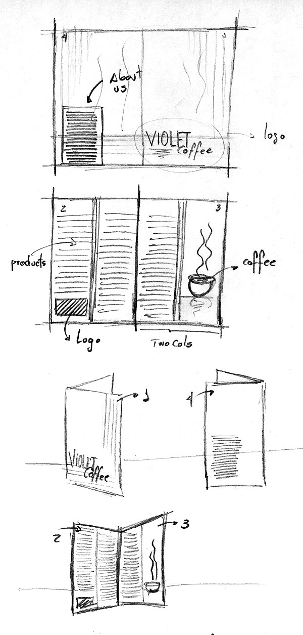
Remember, pen and paper first! Draft what you want to achieve and how you want to make it. Below there’s a quick draft that I did, which will be the starting point of the design. There will be two pages, front and back.
On the front page we will have the cover and back cover layout, and on the back page we will have the actual menu text. The design will be folded as a booklet. We will use violet and black colors for the background and mostly white text. The paper size may be variable, I’m thinking of a "double – letter" size, which means that each page will be an actual Letter size. It’s common to print the menus on big sizes, but depends on you. Once you have the idea of what you want to achieve, it’s time to move forward.
Step 1
We will create a single Photoshop document to mock up the backgrounds, create the image with the company name and add the cup of coffee.
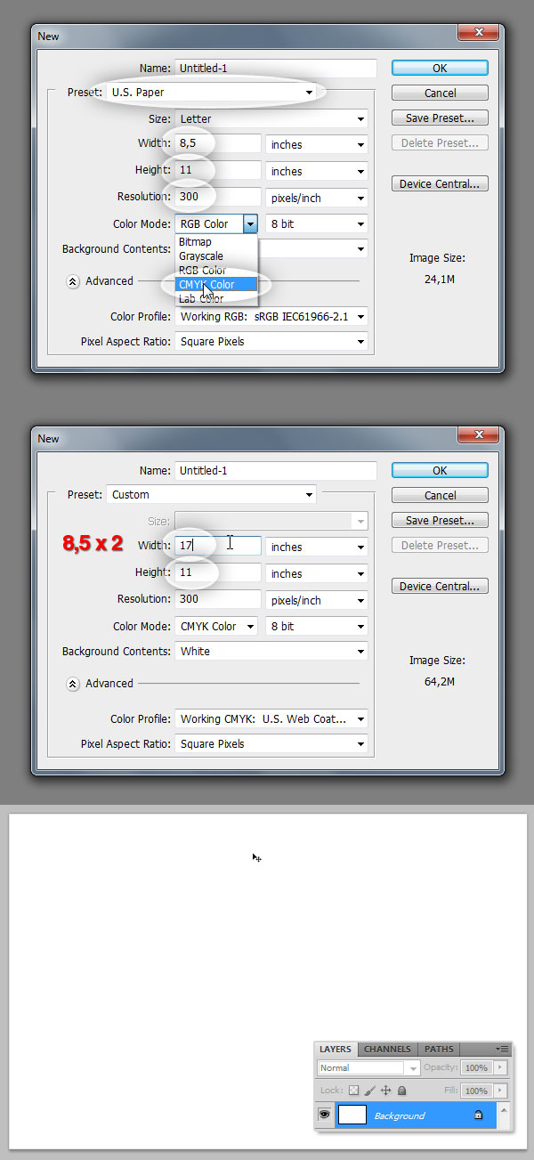
Let’s start this adventure, open Photoshop and then go to File > New. First of all you need to decide which size of paper you want to use, this may vary depending on the client’s budget. This time we will start with a standard Letter Size of 8,5 x 11 inches. It’s very important to set up the resolution at this point, the minimal Print Resolution that works (in my experience) is 300 pixels/inch. And this time I’ll start working directly with CMYK Color Mode.
The cover and back cover of the booklet will be a unique piece of paper that will be folded after print. In order to make the background look nice and fluid (without undesired cutoffs), we will design it in a single document, which means duplicate the document width to convert it into a "Double Letter" piece of paper.
Duplicate the width size of the Letter paper to 17 inches (8,5 x 2). Once you double-check everything is correctly set up, hit OK.
Step 2
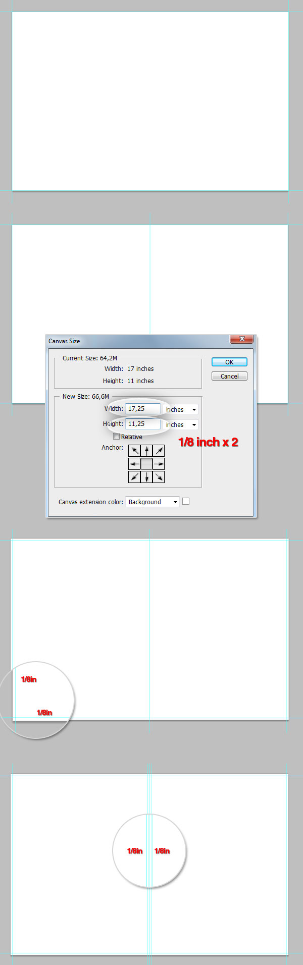
Now we’ve got the printable canvas, but we need to increase the design area a little bit with a security Bleed. Show the Ruler (Command + R) and add four Guides (click over the rule and drag) around the document borders, then go to Image > Canvas Size and increase the document size 1/8 inch at top, bottom, left and right. The quickest way of doing this is to add 1/4 inch (1/8 x 2) which means 0,25 inch to the canvas width and height as shown in the image below. Ensure the anchor point is located at the center and hit OK, you should have your canvas increased by 1/8 inch on all the borders.
Finally, add a Guide exactly to the horizontal center to divide the document into two columns. Use the rule to draw two more guides 1/8 inches to the left and right of the middle guide, to create something like a middle bleed area.
Designing the Background
Step 3
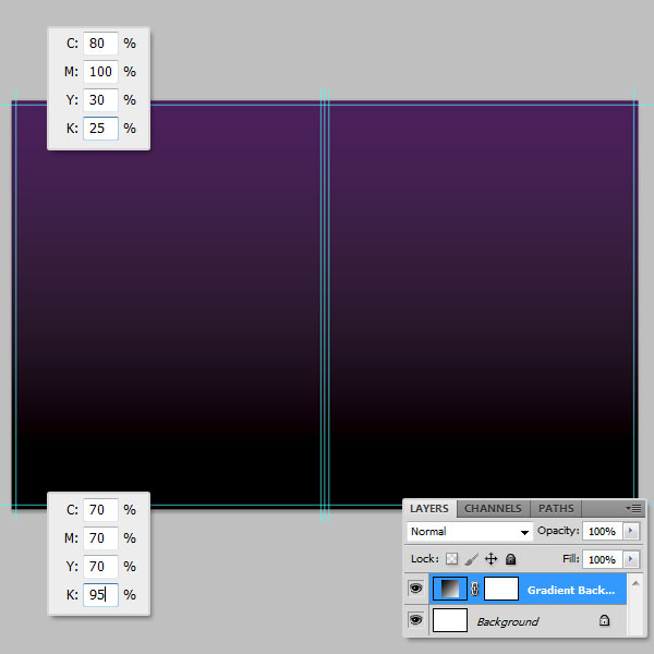
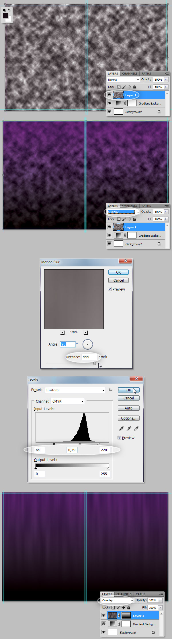
Let’s start with the actual graphic design. First of all we will create a Gradient Fill Layer, go to Layer > New Fill Layer > Gradient and set the following values to the gradient colors: Violet (C:80, M:100, Y:30, and K:25), and Black (C:70, M:70, Y:70, and K:95) which is a common version of rich black and works really good. If you want to know more about using black in print design, take a look at this link: The Ultimate Guide to Designing with Black. Be sure to set the Angle to 90 degrees.
Step 4
Now add some effects to the to the background. Create a new layer above the gradient background, set the Front color to: C:80 M:70 Y:60 K:80 and the Background color as White. Now go to Filter > Render > Clouds. Change the cloud layer’s Blending Mode to Overlay.
Then, go to Filter > Blur > Motion Blur, set the Angle to 90 degrees and Distance to 999 px. Finally adjust the Levels (Command + L) as shown at the bottom of the image below to finish the effect.
Step 5
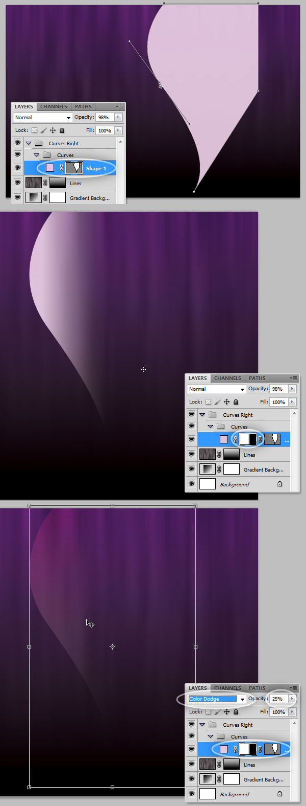
Using the Pen Tool, draw a shape similar to the one shown in the image below. Fill the path with this color: C:10, M:15, Y:0, and K:0. To keep the layers organized I’m using Layer Groups, first create a folder named "Curves Right" and put all the curves of the right side of the canvas there.
After drawing the curve, go to Layer > Layer Mask > Hide All and fill it with a Horizontal Gradient (White to Black) making visible just a part of the left side of the curve. Finally change the curve Layer Opacity to 25% and set its Blending Mode to Color Dodge.
Step 6
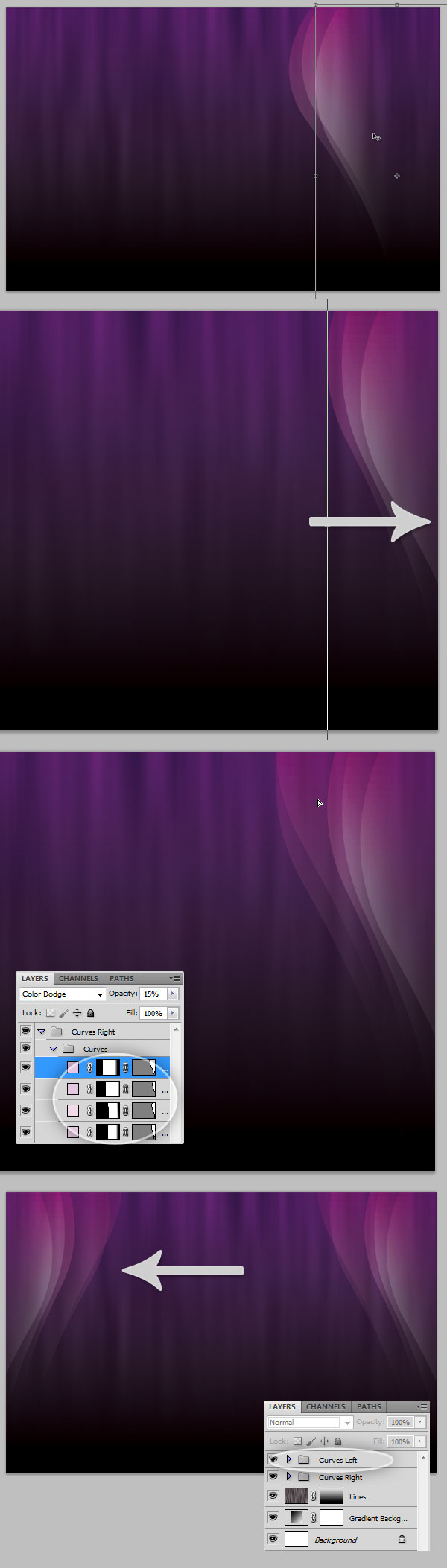
Duplicate the Curve as many times as you want (hold the Alt key and Drag) and use the Transformation Tools to distort each duplicated curve in order to get something like the image below. You can add as many curves as you want. Try changing the opacity value on each one to obtain a nice effect.
Then select the "Curves Right" group and drag it to the right side of the canvas. Then duplicate the entire group (you can hold the Alt key and drag) and go to Edit > Transform > Flip Horizontal to reflect the curves, then select the new Group that you can name "Curves Left" and drag it to the left side of the canvas.
Step 7
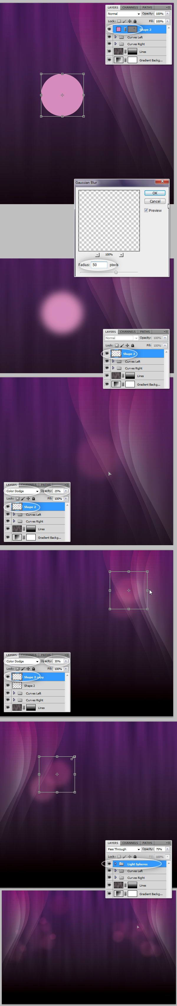
Create a new layer above the "Curves." Use the Ellipse Tool (U) to draw a pink (C:5 M:55 Y:0 K:0) circle (hold the Shift key to make it perfect). Then go to Filter > Blur > Gaussian Blur you’ll be asked to Rasterize the Shape, do it; set the Radius to 50px and hit OK. Next, change the circle’s Blending Mode too and the Opacity to 25%, then place it somewhere over any of the curves.
Duplicate this layer as many times as you want, changing the Opacity value and resizing each copy a little bit. Try to get something like the bottom of the image below. Once you’ve finished, put all the layers into a folder named something like "Light Spheres."
Step 8
For this step you’ll need to open the Stars Brushes set. In a new layer paint some White (C:0, M:0, Y:0, and K:0 ) stars in random places, then add an Outer Glow Layer Style using the Screen Blend Mode, with a Size of 70px and this color: C:15, M:55, Y:0, K:0. Finally set the "Stars" layer Opacity to 70%.

Adding the Name
Step 9
The following step is adding the logo, of course this cannot be named logo, since an actual logotype is a more complicated graphic design piece, so I’ll call it just "company name." Use some guides to divide the left portion of the document in two, both vertical and horizontal. Then use the Type Tool (T) to type the word "VIOLET" in all caps and in White. I’m using the commercial font Avant Garde, but feel free to use any substitute (Futura, Century Gothic, etc). Use the Character values shown below. Then select the letter "O" and change its color to: C:10, M:85, Y:0, and K:0.
Finally, as an additional effect, add to the Text Layer a Gradient Overlay Layer Style (Gray to White) and set the Blend Mode to Linear Burn, Opacity to 75%, and Angle to 90 degrees.

Step 10
Now we will add a reflect effect to the text layer, for this duplicate the text layer, rasterize it (a quick way of doing it is creating a blank layer below it, then select both the copied layer and the blank layer and press Command + E to merge them) and then go to Edit > Transform > Flip Vertical. Place the copy just below the text. Finally, add a Layer Mask > Hide all to the copy and fill it with the Gradient Tool (Black to White).

Step 11
As a final touch, create a new Layer above the "Violet" text layer and use the Stars Brush set to paint some white stars on it. Change the Layer’s Opacity to 85%.

Step 12
Let’s type the word "coffee" in the lower right corner of the word "Violet." For this word you can use any script typeface (I’m using Edwardian Script). Now add a Gradient Overlay Layer Style using these colors: C:10, M:85, Y:0, K:0 and C:15, M:55, Y:5, K:0. Finally, put all the layers related to the company name in a Layers Group named "Logo."
Layer Comps
Step 13
Now we’ll set two Layer Comps in order to save two different versions of the design in two separate files using an Automated Script.
First show the Layer Comps panel, go to Windows > Layer Comps. Ensure the "Logo" folder is visible and on the Layer Comps panel click on the tiny New icon at the bottom, rename the new layer comp to "Cover." Then hide the "Logo" folder, and create a new Layer Comp naming it "Inner" this time. You can toggle the visibility of the layer comps to double-check everything is OK.
Step 14
Go to File > Scripts > Layer Comps to files. In the dialog, set the File Type as PSD, browse where you want to store the new files, name the resultant files with some descriptive prefix like "Violet," and leave all the other settings by default. When you hit on Run, Photoshop will automatically create a new file for each Layer Comp. The name of the new document will include the name of the Layer Comp.
Additional Graphic, a Cup of Coffee
Step 15
Open the cup of coffee image in Photoshop, double-click on the "Background" Layer to make it editable. Then use the Pen Tool in Paths mode, draw around the cup’s silhouette, once you’re finished with the path drawing, click on Exclude Overlapping Path Areas in the Options bar and draw a path inside the cup’s handler. Once you’ve got the paths drawn, go to Layer > Vector Mask > Current Path to convert the path to a vector layer mask extracting the cup from its background.
Step 16
You can drag and drop the coffee cup from its original document to our working document. Once you place it on the design, rasterize the layer if you want too, Option (Right) click on the Layer and select Rasterize Layer; name the resultant layer "coffee cup."
Then, using the same technique as in Step 10, add a reflection to the cup, but this time using a big, soft, black Brush (B) paint a little bit over the layer mask to soften the angular shades, as shown.
Step 17
As a little additional detail we will add a shadow to the cup. Use the Ellipse Tool to draw a rich black ellipse between the "coffee cup" and "coffee cup copy" layers. Then go to Filter > Blur > Gaussian Blur, set the Radius to 35 and hit OK.
Step 18
To keep the violet ambient add a Photo Filter Adjustment Layer above the cup, ensure the Clipping Mask option on the Adjustments Panel is selected and set this color to C:40, M:80, Y:0, K:0 and Density to 25%. Now put all the coffee cup related Layers into a Layer Group named "Coffee cup."
Step 19
Now we will add a little bit of Smoke to the coffee cup. Open the Smoke image from the assets and double-click on the "Background" Layer to make it editable. Hit Command + I to invert the colors of the image. On the Hue / Saturation adjustment window (Command + U) set the Hue value to -92 to make the smoke more violet.
Let’s extract the smoke from its background. In the Channels Panel (Window > Channels) duplicate the Red channel, hit Command + A and Command + C to save the copy to the clipboard, then delete the duplicated channel, click on the RGB channel again to leave the image with its default colors.
In the Layers Panel select the smoke layer and go to Layer > Layer Mask > Hide All, on the Layer Mask miniature, always on Layers Panel, Alt-click on the mask to show it, then Paste the clipboard on the visible Layer Mask. Then click on the actual layer miniature to see how it looks.
Step 20
Drag the smoke layer to our main document. Then rasterize it and name it "Smoke." Place it just above the cup of coffee. Add a Layer Mask to this layer and fill it with a White to Black gradient to hide the bottom of the smoke column. Use a soft black brush to paint over the layer mask to hide the top of the smoke column.
Finally, duplicate the "Smoke" layer, place the copy above the original layer and go to Filter > Blur > Gaussian Blur, then set the radius to 35%. This will add a nice glow to the smoke layer.
Step 21
Now, in order to increase the visual impact of the coffee cup, add some lights and stars, just like we did on the background at the steps 7 and 8. Finally, put all the layers related to the coffee cup, including the smoke, the lights and stars, into a new Layer Group named "Coffee."
Exporting the Additional Graphics
Step 22
Revising, we have two important layer groups for this step: "Coffee" and "Logo." Both will be additional graphics that we will import later on into the InDesign document, so we need to export each one as a different file. Let’s start with the "Logo" group, duplicate it (drag the group over to the New button at the bottom of the Layers Panel), select the "Logo copy" group and press Command + E to rasterize it. Do exactly the same with the "Coffee" Group.
Step 23
Select the "Logo copy" layer, then Option (Right) – Click on it and select Duplicate Layer, on the popup dialog, write a name for it and select Destination of New. This will create a copy of the logo layer in a document with the same width and height as the original. Use the Crop Tool to cut all the blank space on the copy, then save the document with some descriptive name like: "Logo.psd." Repeat the process with the "Coffee copy" layer.
Resultant Files
Step 24
That’s it with Photoshop, at this point you should have the following important elements to use them on the next part of this tutorial: two PSD files with the backgrounds, one for the cover and another for the internal pages. A PSD file including the Logo with a transparent background, and another document including the coffee cup with transparent background as well.
Now we are ready to create a printable document in InDesign and add the information provided by the client.
Now we are ready to create a printable document in InDesign and add the information provided by the client.

Tidak ada komentar:
Posting Komentar